Likes
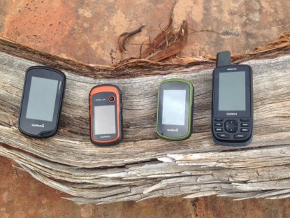
The Garmin Dakota 20 is a smaller and lighter version if the Garmin Oregon series. It offers hikers and geocachers an affordable touchscreen device that makes text entry easier than on a push button unit. It's also small enough to fit in your pocket and light enough to join you anywhere. This is our favorite affordable touchscren device. Get it if you don't want to cough up the cash for the Oregon series.
Garmin's software, Basecamp, is equally powerful yet easier to use than Magellan's VantagePoint, and it's much simpler than DeLorme's Topo North America. One of our favorite features is its ability to show waypoints and tracks in Google Earth.
Dislikes
The main drawback to the Dakota 20 is its lack of push buttons. (The power button is the only button.) Magellan incorporates two customizable push buttons on its eXplorist 710 that, under the default configuration, take a photo and mark a waypoint. This is an excellent feature that would greatly improve the Dakota 20. Not having buttons can be problematic in cold weather when the screen tends to behave sluggishly and requires bare fingertips. We found that it takes longer to move from one page to another with the current version of the Dakota 20's interface. Exiting the map view to mark a waypoint can take three taps. A push button device can do it with one touch of a button. Comparing the touchscreen interface of the GPS units we tested to those of iPhone and Android will leave the GPS user disappointed. In Apple's iOS5, for example, two taps of the Home Button bring up the four most commonly used applications. A feature like this combined with the addition of two hard buttons would make this device's interface much more efficient.
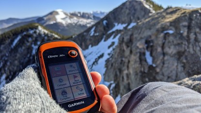
Although the Dakota 20's touchscreen makes typing faster, we still aren't impressed with the display when compared to other electronic gadgets. Again, the iPhone 4's display is orders of magnitudes better (higher resolution, more precise, improved visibility). The plastic touchscreens found on the GPS units we tested were considerably harder to see in direct sunlight than standard GPS screens. In sum, get a touchscreen if you enter lots of text. Otherwise we recommend push button units with standard displays.
Value
This is the cheapest good quality touchscreen device we tested. Though we recommend getting the Oregon 550, the Dakota 20 could be a good bet if you don't want to spend the extra money. The eTrex 20 is slightly cheaper and is easier to see in direct sunlight, but also slower for entering text. Your screen preference will determine which is best for you.